
Colour Profiles for Marketing Images: A Practical Guide for Designers

For almost every digital marketing asset, use sRGB with an embedded profile. For print, request the printer's specific ICC profile and soft-proof before you export. Those two rules cover the vast majority of the decisions a marketing team or designer will ever face with colour profiles.
The exceptions are narrow. Display P3 is worth considering for campaigns delivered primarily through modern Apple devices and iOS apps, where the wider gamut is actually rendered. ProPhoto RGB and Adobe RGB (1998) belong in your editing masters only, never in a file you hand to a web developer or upload to a social platform.
Here is what to do right now:
- Convert to sRGB at export for every web, social, and email asset.
- Always embed the colour profile on export, regardless of format.
- Request the printer's ICC profile before you start any print job.
- Soft-proof against that ICC before flattening and exporting the print file.
- Keep your master files in ProPhoto RGB or Adobe RGB at 16-bit.
Pro Tip: Set up two export presets in Photoshop or Lightroom: one labelled WEB (sRGB, embed profile, JPEG) and one labelled PRINT (printer ICC or TIFF with embedded profile). Running every job through those two presets eliminates the most common colour errors before they reach a client or press.
Key takeaways
sRGB with an embedded profile is the correct output space for almost every digital marketing asset; print jobs require a vendor-specific ICC profile and a soft-proof before export.
| Point | Details |
|---|---|
| Default digital output | Use sRGB with an embedded profile for all web, social, email, and presentation assets. |
| Print workflow | Request the printer's ICC profile, soft-proof against it, and export TIFF with the profile embedded. |
| Wide-gamut masters | Keep ProPhoto or Adobe RGB masters at 16-bit; never deliver these spaces to web or uncontrolled environments. |
| Monitor calibration | Calibrate monthly with a hardware colourimeter (X-Rite or Datacolor) and maintain neutral ambient lighting. |
| Alex Gell deliverables | Alex Gell provides calibrated master files, sRGB web exports, and print-ready files with ICC details for every commercial commission. |
Table of Contents
- Which colour profile should you use for each marketing channel?
- What is an ICC colour profile and why does it matter?
- sRGB, Adobe RGB, ProPhoto RGB, and CMYK: which space for which job?
- Why monitor calibration is the foundation of reliable colour decisions
- Photoshop and Lightroom: the exact steps for colour-safe export
- Preparing files for print: getting the ICC right before you export
- Common mistakes and a pre-delivery checklist
- Managing colour profiles across social media, mobile apps, and beyond
- Troubleshooting colour mismatches between devices and viewing environments
- Keeping colour consistent across a team and multiple tools
- Who is actually responsible for colour in a campaign?
- Colour-managed photography, delivered ready to use
- Sources
Which colour profile should you use for each marketing channel?
The answer changes depending on where the image ends up, not where it was edited. Here is the channel-by-channel breakdown.
Social platform behaviour deserves a specific note. Instagram re-encodes uploaded images and, depending on the client and OS version, may or may not honour the embedded profile. Facebook behaves similarly. The practical defence is to upload sRGB files with the profile embedded: if the platform strips the tag, the image still looks correct because sRGB is the assumed default. Uploading an Adobe RGB file without conversion is the scenario that produces the flat, washed-out result you have probably seen.
Display P3 covers a gamut close to Adobe RGB (1998) and is natively supported on iPhone, iPad, and recent Mac displays. For campaigns where the primary delivery surface is iOS and you control the production environment end-to-end, P3 can deliver noticeably richer reds and greens. Outside controlled contexts, stick with sRGB.
Pro Tip: Before signing off any campaign, view the exported files on at least three devices: a calibrated desktop monitor, a mid-range Android phone, and an iPhone. Colour shifts that are invisible on a wide-gamut studio monitor become obvious on a phone screen with aggressive display processing.
What is an ICC colour profile and why does it matter?
An ICC profile is a standardised data file, defined by the International Colour Consortium, that describes how a specific device or colour space maps numeric values to actual visible colours. Without one, a set of RGB numbers is ambiguous: R=220, G=60, B=80 looks different on a calibrated studio monitor, a budget laptop, and a commercial press.
There are two distinct types of profile, and confusing them causes most colour problems.
- Device profiles describe the colour behaviour of a specific piece of hardware: a monitor, a printer, or a scanner. They are created by measuring the device's actual output.
- Document profiles (also called working space or embedded profiles) are tags attached to an image file. They tell any software opening the file which colour space the numbers were written in.
When Photoshop opens a JPEG with an embedded sRGB profile, it knows exactly how to display those values. When it opens an untagged file, it guesses, usually defaulting to sRGB. That guess is often wrong if the file was edited in Adobe RGB, which is why untagged assets default to sRGB in browsers and social platforms, making images edited in wider spaces look dull or shifted.
A few terms worth knowing:
- Gamut: the range of colours a device or colour space can reproduce.
- Working space: the colour space you edit in (e.g. Adobe RGB, ProPhoto RGB).
- Soft-proofing: simulating on screen how an image will look on a specific output device, using that device's ICC profile.
- Rendering intent: the rule used when converting colours that fall outside the destination gamut (Perceptual and Relative Colorimetric are the two most common for photography).
- Embedding: writing the profile tag into the exported file so any downstream software knows how to interpret the values.
sRGB, Adobe RGB, ProPhoto RGB, and CMYK: which space for which job?
Choosing the right colour space is a matter of matching the space's gamut to the output device's capability, and keeping wide-gamut masters separate from delivery files.
sRGB
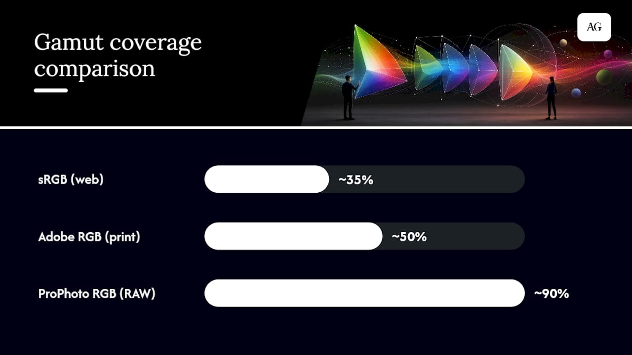
sRGB covers roughly 35% of the visible colour gamut and is the default interpretation for images without an embedded profile. Every browser, every social platform, and virtually every consumer display is built around it. Edit in sRGB only when you know the final output is web-only and you have no print requirement. The risk of 8-bit work in sRGB is low because the gamut is small enough that banding is rarely a problem.
Adobe RGB (1998)
Adobe RGB covers a wider gamut than sRGB, particularly in the cyan-green range, making it useful for images destined for high-quality inkjet or offset print where the press can reproduce those colours. Edit in Adobe RGB when you are producing files for print and your monitor can display it accurately. Never deliver Adobe RGB to a web context without converting first: browsers that encounter an untagged Adobe RGB file will render it as sRGB, compressing the colours and producing a flat result.
ProPhoto RGB
ProPhoto RGB is the widest of the common working spaces and is designed for RAW processing and archival masters, not delivery. Keep a wide-gamut master in ProPhoto at 16-bit, then export to sRGB for web or to the printer's ICC for print. Working in ProPhoto at 8-bit is genuinely risky: the gamut is so large that 8-bit quantisation produces visible banding in smooth gradients.
CMYK and ECI/FOGRA profiles
CMYK is not a single colour space. It is a family of device-dependent spaces defined by the ink set, paper, and press conditions. The European Color Initiative (ECI) and FOGRA publish standardised press profiles, such as FOGRA51 for coated paper and FOGRA52 for uncoated, which are widely used by European print vendors and referenced in ISO 12647-2. Ask your printer which profile they use before converting. In many professional workflows, the print house performs the final RGB-to-CMYK conversion themselves using their calibrated press profile, which is often the safer approach unless you have the vendor profile and the expertise to use it correctly.
| Colour space | Best for | Gamut | Edit in? | Deliver in? |
|---|---|---|---|---|
| sRGB | Web, social, email | ~35% of visible gamut | Yes (web-only projects) | Yes |
| Adobe RGB (1998) | Print, wide-gamut inkjet | ~50% of visible gamut | Yes (print projects) | Print only, with ICC |
| ProPhoto RGB | RAW masters, archival | ~90% of visible gamut | Yes, at 16-bit only | Never for delivery |
| CMYK (FOGRA/ECI) | Offset and commercial print | Press-dependent | Rarely | Yes, with vendor ICC |
Why monitor calibration is the foundation of reliable colour decisions
Every colour decision you make is only as trustworthy as the screen you are looking at. A monitor that has drifted from its calibrated state, or that was never calibrated, turns soft-proofing into guesswork and makes colour matching across team members nearly impossible.

Calibrate monthly with a hardware colourimeter or spectrophotometer and maintain neutral ambient lighting. The tools most widely used in professional workflows are the X-Rite ColorChecker Display, the X-Rite i1Display, and the Datacolor Spyder series. Each creates a custom ICC device profile for your specific monitor, which your operating system then uses to compensate for the display's actual behaviour.
Here is the practical calibration sequence:
- Set ambient lighting to a neutral, consistent level before you start. Avoid direct sunlight on the screen.
- Warm up the monitor for at least 30 minutes before calibrating.
- Connect the colourimeter and launch the calibration software (X-Rite i1Profiler, Datacolor Spyder software, or similar).
- Set your calibration targets: D65 white point, gamma 2.2, and a luminance of 80–120 cd/m² for print-referenced work.
- Run the measurement sequence and save the resulting ICC device profile.
- Activate the profile in your operating system's display settings and confirm your editing software is using it.
- Repeat monthly, or immediately after any significant change in ambient lighting or monitor settings.
Wide-gamut monitors introduce an additional consideration. A display covering DCI-P3 or AdobeRGB will show colours that sRGB content was never intended to reach, which can make web images look oversaturated in editing. The solution is a monitor with a calibrated sRGB emulation mode, which clamps the display to the sRGB gamut while still allowing you to switch to the full gamut for print work.
Pro Tip: If you work on a single monitor and produce both web and print assets, choose a display with a hardware-level sRGB emulation mode, such as those in the EIZO ColorEdge or BenQ SW series. Calibrate both modes separately and switch modes depending on the output you are reviewing.
Photoshop and Lightroom: the exact steps for colour-safe export
Getting the settings right in Photoshop and Lightroom is where most colour errors are either prevented or introduced.
Photoshop colour settings
Open Edit > Colour Settings and confirm:
- Working space RGB is set to sRGB IEC61966-2.1 for web-focused work, or Adobe RGB (1998) for print-focused work.
- Colour management policies are set to "Preserve Embedded Profiles" for all three channels.
- Profile mismatches and missing profiles are both set to "Ask When Opening."
Adobe recommends preserving embedded profiles and warning on mismatches so you are never silently converting a file to the wrong space.
Soft-proofing in Photoshop
- Go to View > Proof Setup > Custom.
- Under "Device to Simulate," select the printer's ICC profile.
- Set rendering intent to Perceptual for photographic images, or Relative Colorimetric with Black Point Compensation for images with near-neutral tones.
- Tick "Simulate Paper Colour" to see the effect of the paper white.
- Enable View > Proof Colours (Ctrl/Cmd+Y) to toggle the soft proof on and off.
- Use View > Gamut Warning (Ctrl/Cmd+Shift+Y) to highlight out-of-gamut colours in the proof view.
Soft-proofing in Lightroom
In the Develop module, tick the Soft Proofing checkbox at the bottom of the preview area. Select the printer's ICC from the Profile dropdown. Lightroom will create a virtual copy for proofing adjustments, keeping your master untouched.

Export settings
In Photoshop, use File > Export > Export As for web files and tick "Convert to sRGB" and "Embed Colour Profile." For print files, use Edit > Convert to Profile, select the printer ICC, then save as TIFF. In Lightroom, the export dialogue has a "Colour Space" dropdown: select sRGB for web and "Other" to load a custom ICC for print.
Preparing files for print: getting the ICC right before you export
The most reliable print workflow starts with a conversation, not a conversion. Request the specific ICC profile for your chosen paper and substrate from the print vendor before you open the file in Photoshop. If the vendor uses a standard press condition, they will typically point you to a FOGRA or ECI profile, which you can download from the ECI website (eci.org) or the FOGRA media wedge resources.
Once you have the profile:
- Install it in your operating system's colour profiles folder (on macOS: Library/ColorSync/Profiles; on Windows: Windows/System32/spool/drivers/color).
- Open your master file in Photoshop and run a soft proof against the vendor ICC before making any adjustments.
- Note any gamut warnings and adjust colours in the master file, not in a flattened copy.
- When the soft proof looks correct, use Edit > Convert to Profile to convert to the vendor ICC, then export as TIFF.
- Send the TIFF with the ICC embedded and confirm with the vendor that they will use application-managed colour, not printer-managed colour.
That last point matters. Disabling colour management in the printer driver and letting the editing application handle the ICC conversion prevents double-conversion, where the driver applies a second colour transformation on top of the one already baked into the file. Double-conversion is one of the most common causes of unexpected colour shifts on press.
Pro Tip: Before approving a full print run, request a small test print on the actual media. A single A4 or letter-size proof on the exact paper stock costs almost nothing and catches gamut or density issues that no soft proof can fully replicate.
Common mistakes and a pre-delivery checklist
The same errors appear repeatedly across marketing teams and agencies. Knowing them in advance is the fastest way to avoid a costly reprint or a client revision cycle.
Common mistakes:
- Delivering Adobe RGB files to a web developer or uploading them directly to social platforms without converting to sRGB.
- Forgetting to embed the colour profile on export, leaving files untagged and subject to browser guessing.
- Skipping soft-proofing and discovering gamut problems only after the print run.
- Enabling colour management in both the editing application and the printer driver simultaneously, causing double-conversion.
- Using inconsistent file naming that makes it impossible to track which version is the web export and which is the print master.
Pre-delivery checklist:
- Confirm the master file is saved in ProPhoto or Adobe RGB at 16-bit with the profile embedded.
- Verify the web export is sRGB, JPEG, 8-bit, with the profile embedded.
- Verify the print export uses the vendor's ICC, is saved as TIFF, and has the profile embedded.
- Check that the printer driver's colour management is disabled if the application is handling the conversion.
- Confirm metadata includes usage licence, copyright, and creation date.
File naming convention example:
[ClientName]_[ProjectCode]_[AssetDescription]_[Version]_[Profile].ext
For example: BrandX_2026_HeroShot_v2_sRGB.jpg or BrandX_2026_HeroShot_v2_FOGRA51.tif
A photography style guide that specifies colour palette rules, saturation limits, and file conventions is the single most effective tool for keeping visual brand consistency across multiple touchpoints and team members.
Pro Tip: Build the pre-delivery checklist into your project management tool as a task template. Every image delivery job should close with a completed checklist, not a verbal confirmation. That one habit eliminates most revision cycles before they start.
Managing colour profiles across social media, mobile apps, and beyond
Social platforms and mobile environments add complexity because colour management is inconsistent and often invisible to the person uploading the file.
Instagram processes uploaded images through its own compression pipeline. On iOS devices with Display P3 screens, Instagram can render P3 content when the app and OS support it, but this behaviour is not guaranteed and changes with app updates. The safe default remains sRGB with the profile embedded. Facebook applies similar compression and generally treats uploaded images as sRGB regardless of the embedded tag.
LinkedIn and Twitter/X both re-encode images on upload. LinkedIn tends to preserve colour reasonably well for sRGB files; Twitter/X compression is more aggressive and can shift colours noticeably. For both, export sRGB at the platform's recommended dimensions to minimise re-encoding artefacts. For 2026, Instagram's recommended image size for feed posts remains 1080×1080px for square and 1080×1350px for portrait, with sRGB colour.
Mobile apps built on iOS and Android can support Display P3 natively when the developer implements colour management correctly. If you are supplying assets for a branded app, ask the development team whether the app is colour-managed and which colour space the asset pipeline expects. Supplying P3 assets to an unmanaged app pipeline produces the same washed-out result as supplying Adobe RGB to a browser.
For digital out-of-home (DOOH) and retail display screens, the display hardware is rarely calibrated to a known standard. Request the display specification from the venue or media owner, and if no specification is available, deliver sRGB and accept that the display's own processing will determine the final result.
Troubleshooting colour mismatches between devices and viewing environments
Colour mismatches between devices are almost always caused by one of four things: an unembedded profile, a colour-management gap in the software, an uncalibrated monitor, or a mismatch between the editing space and the delivery space.
Diagnosis steps:
- Open the file in Photoshop and check Image > Mode and Edit > Assign Profile to confirm what profile is embedded (or whether one is missing).
- If the file looks correct in Photoshop but wrong in a browser, the browser may not be colour-managing the image. Test in Safari (which colour-manages) and Chrome (which does for tagged files) to isolate the issue.
- If the file looks correct on your monitor but wrong on a client's screen, the client's monitor is likely uncalibrated. Share a reference swatch alongside the image so the client has a known anchor.
- If print output looks darker or more saturated than the screen preview, the soft proof was either not run or the monitor luminance is set too high relative to the print viewing conditions.
Quick fixes by symptom:
- Flat, desaturated image on web: the file was delivered in Adobe RGB without converting to sRGB. Re-export with Convert to sRGB ticked.
- Colour shift between team members' screens: one or more monitors are uncalibrated. Run calibration on all machines before the next review session.
- Print looks different from screen: soft-proof was skipped, or the wrong ICC was used. Obtain the correct vendor ICC and re-proof before reprinting.
- Colours look different on mobile vs desktop: the mobile device has a Display P3 screen with its own tone mapping. Export sRGB and test on the specific device before final approval.
Keeping colour consistent across a team and multiple tools
Colour consistency across a team is a process problem as much as a technical one. The technical settings are straightforward; the harder part is making sure every person on the team uses them every time.
Start with a shared colour settings file. In Photoshop, go to Edit > Colour Settings, configure the settings as described above, and save the .csf file. Distribute it to every team member and ask them to load it via the same menu. This synchronises working spaces, profile policies, and mismatch warnings across the team without relying on individual memory.
Lightroom users should agree on a standard export preset and share it as a .lrtemplate or .xmp file. The preset should specify colour space (sRGB), bit depth, file format, and whether to embed the profile. Anyone who exports from Lightroom uses the shared preset, not a custom one built from memory.
For teams using multiple tools, including Figma, Canva, or Adobe InDesign alongside Photoshop, the key rule is that colour management happens at the point of export, not inside the design tool. Figma, for example, works in sRGB and exports sRGB by default, which is correct for web assets. InDesign handles CMYK and embedded ICC profiles for print layouts. The risk comes when a designer exports from Figma and then places that file into InDesign for a print job without checking the colour space.
Include explicit colour-space rules in the brand style guide alongside hex codes and Pantone references. A style guide that specifies "all photography assets delivered as sRGB JPEG with embedded profile" removes ambiguity for every supplier, agency, and in-house designer who touches the brand. For broader marketing content production workflows where colour-managed assets are required across multiple channels, agreeing on these specifications at the brief stage, rather than the delivery stage, saves significant time. Marketing content pipelines that define colour requirements upfront avoid the most common revision loops.
Who is actually responsible for colour in a campaign?
The honest answer is that colour responsibility is shared, and the problems happen precisely when everyone assumes someone else is handling it.
From my experience working across commercial campaigns, the most common source of colour disappointment is not a technical failure. It is a brief that never specified colour requirements. A client approves a mood board on a phone screen, a photographer delivers files calibrated to a studio monitor, a designer places those files in a layout viewed on an uncalibrated laptop, and the printer uses a generic CMYK conversion because nobody sent them an ICC. Every step was done in good faith. The result still looks wrong.
The fix is straightforward: make colour requirements explicit at the brief stage, not the delivery stage.
- Client sign-off on a colour reference: before any shoot or production begins, agree on a physical or digital colour reference. A printed swatch, an approved sample image, or a Pantone reference gives everyone a shared anchor.
- Photographer or retoucher responsibility: deliver master files with embedded profiles, web exports in sRGB, and print-ready files with the vendor ICC noted in the delivery spec. Soft-proofing is part of the retouching process, not an optional extra.
- Designer responsibility: confirm the colour space of every placed image before export. Do not assume a file from an external supplier is in the correct space.
- Print vendor responsibility: confirm the press profile and provide a physical proof before the full run. If the vendor cannot provide a proof, that is a risk worth naming explicitly in the project.
- Client responsibility: approve the soft proof or physical proof in writing before the press run. A verbal "looks fine" on a phone call is not a colour approval.
Including colour profile requirements in the creative brief, the delivery specification, and the approval sign-off document makes responsibilities explicit and removes the ambiguity that causes most disputes. It is not bureaucracy. It is the fastest way to get the colour right the first time.
Colour-managed photography, delivered ready to use
Every image Alex Gell delivers comes with a colour-managed workflow built in from capture to export. That means calibrated capture, embedded ICC profiles, web-ready sRGB exports, and print-ready files with the vendor ICC noted, so your team can place assets directly into layouts without a round of colour corrections.

Whether you need fast-turnaround web assets from a corporate event in London or print-ready imagery for a product campaign in Oxfordshire, every delivery includes master files, channel-specific exports, and usage licence details. You get files that are ready for your designer, your printer, and your social team, without the back-and-forth. View the commercial portfolio or get in touch to discuss your next project.
Sources
The following resources are worth bookmarking for deeper technical reference and profile downloads.
- Color management for creators - ICC profiles (EIZO)
- Guide to sRGB vs Adobe RGB vs ProPhoto RGB (Marco De Maio)
- Colour management guide (ViewSonic)
