
Print Resolution for Posters: How to Size Images for Sharp Prints
For most posters viewed from a normal standing distance, a moderate PPI (pixels per inch) at the final output size is sufficient. Close-view photographic or fine-art prints benefit from 200–300 PPI. Very large banners and billboards can be prepared at much lower PPI without visible loss of sharpness due to the large viewing distance.
Here is the quick-reference breakdown:
- 100–150 PPI — standard wall posters viewed from 1–3 metres
- 150–200 PPI — photographic prints inspected at arm's length
- 200–300 PPI — fine-art or close-view prints (A4/A3 framed work)
- 50–100 PPI — large-format graphics viewed from 3–10 metres
- 25–50 PPI — banners and billboards at 10+ metres
Pro Tip: After placing your image into your layout software, always check the effective PPI at the scaled size, not the file's native resolution.
Key takeaways
For most posters, 100–150 PPI at the final output size delivers sharp, professional results — and checking effective PPI after placing images in your layout is the single most important step you can take before sending files to print.
| Point | Details |
|---|---|
| Choose PPI by viewing distance | Use 100–150 PPI for standard wall posters; 150–200 PPI for close-view photographic prints. |
| Calculate pixel dimensions first | Multiply your print size in inches by your target PPI to get the required canvas pixel dimensions. |
| Check effective PPI after scaling | A 300 PPI image scaled to 200% in layout becomes 150 PPI — always verify in the Links panel or Image Size. |
| Set 3 mm bleed from the start | Extend image and background layers 3 mm beyond the trim edge before export, not as an afterthought. |
| Request a proof for critical prints | Ask your print shop for a contract proof or small test print before committing to a full photographic poster run. |
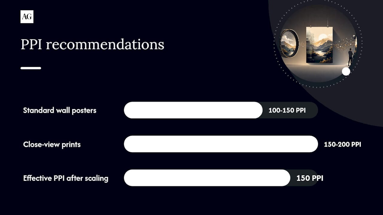
Table of Contents
- What do DPI and PPI actually mean for your poster files?
- Recommended PPI and pixel dimensions for common poster sizes
- How do you check your image's resolution before printing?
- When is upscaling acceptable, and when should you replace the image?
- File formats, colour profiles, and bleed: getting your file print-ready
- Your pre-press checklist before sending files to a UK print shop
- Alex Gell's practical tips for shooting images destined for poster printing
- Which printing technologies are used for posters, and what resolution do they offer?
- How does paper or material choice affect your print quality?
- Troubleshooting common print resolution problems
- What I've learned from preparing files for print
- Sources
What do DPI and PPI actually mean for your poster files?
These two terms get swapped constantly, and the confusion costs designers real money. PPI (pixels per inch) is a property of your image file. It describes how many pixels exist across each inch of the image at a given output size. DPI (dots per inch) is a property of the printing device itself, describing how many ink dots it lays down per inch of substrate.
Printers commonly output at high DPI levels, reproducing each image pixel with multiple ink dots to blend colours smoothly. A 150 PPI file can still print beautifully on a high-DPI device because the printer has more than enough dots to render each pixel with precision. Chasing 600 PPI in your source file does not give you 600 DPI output quality — it just inflates your file size and slows pre-press.
The human eye resolves roughly 300 PPI at 25–30 cm (arm's length). Step back to one metre and that threshold drops considerably. Viewing distance is the dominant variable for perceived sharpness — which is why a 150 PPI poster on a wall looks crisp while the same file held six inches from your face would look soft.
Key distinction: You control PPI. Your printer controls DPI. Design to the PPI your viewing distance demands, and trust the printer's DPI to handle the rest.
Recommended PPI and pixel dimensions for common poster sizes
The table below converts PPI targets into exact pixel dimensions for the most common poster formats. Use it to set your canvas size before you start, or to verify an existing file.
Worked example — A1 poster at 150 PPI: A1 measures 23.4 × 33.1 inches; multiply dimensions by your chosen target PPI to get your canvas pixel dimensions.
Worked example — 24 × 36 inch poster at 150 PPI: For example, a 24 by 36 inch poster multiplied by your target PPI gives the necessary pixel dimensions. A modern full-frame camera shooting RAW at a typical megapixel count usually produces images that can meet or exceed these pixel requirements, allowing room to crop.
According to HP's large-format guidance, many large-format projects are sufficiently sharp at around 100 PPI, with 300 PPI reserved for close-view work. Choose your column based on the viewing distance guidance in the section above.
How do you check your image's resolution before printing?
Catching a low-resolution file before it reaches the printer saves time, money, and disappointment. Here is how to check in the tools you are most likely using.
- Adobe Photoshop — Go to Image > Image Size. Deselect "Resample" and type your intended print width. The resolution field updates to show the effective PPI at that size. If it falls below your target, you need more pixels.
- Adobe InDesign (Links panel) — Open Window > Links. Select your placed image and expand the Link Info panel. Look for "Effective PPI" — this is the resolution after any scaling you have applied in the layout. Pre-press will flag anything below 100 PPI.
- GIMP — Go to Image > Scale Image. The width, height, and resolution fields show current pixel dimensions and PPI. Change the print size fields (not the pixel fields) to see what PPI you would achieve at your target output size.
- macOS Preview — Open the image, then go to Tools > Adjust Size. Deselect "Resample image" and enter your print width. The resolution field shows the resulting PPI.
- Windows Explorer — Right-click the file, select Properties > Details. You will see horizontal and vertical resolution in DPI. Note that this reflects the embedded metadata, not the effective PPI after scaling in a layout.
The critical distinction is resample vs resize. Resizing changes the output dimensions without adding or removing pixels — the PPI adjusts accordingly. Resampling adds or removes pixels to hit a target size at a set PPI, which is where quality loss can occur. Only resample when you genuinely need more pixels; never resample just to inflate a metadata number.
When is upscaling acceptable, and when should you replace the image?
Upscaling is sometimes unavoidable, but it has real limits. Standard bicubic interpolation (available in Photoshop and GIMP) works well for modest increases, typically up to around 1.5× the original pixel dimensions. Beyond that, the algorithm runs out of real detail to work with and the result looks soft or plasticky.
Modern AI upscalers — tools such as Topaz Gigapixel AI, Adobe Photoshop's Super Resolution, and ON1 Resize AI — use trained neural networks to reconstruct plausible detail rather than simply averaging neighbouring pixels. They can handle increases of 2× to 4× with noticeably better results than bicubic, particularly on photographic subjects with natural texture. That said, no upscaler recovers detail that was never captured. A soft, motion-blurred, or heavily compressed source image will still look soft after upscaling — just at a larger size.
Practical image upscaling is limited in usefulness beyond a moderate factor, with quality diminishing as scale increases. If you need more than 2×, the honest answer is usually to replace the image.
Pro Tip: Before committing to a large print run, request a small A4 or A3 test print of the upscaled file from your print shop. Viewing it at arm's length tells you far more than any on-screen zoom.
Common tools worth knowing: Photoshop (bicubic and Super Resolution), GIMP (cubic interpolation), Topaz Gigapixel AI, ON1 Resize AI, and Affinity Photo's upscale function.
File formats, colour profiles, and bleed: getting your file print-ready
File format matters more than many people realise. For photographic posters, a flattened TIFF or a press-quality PDF (PDF/X-1a or PDF/X-4) gives the print house the cleanest, most predictable file. High-quality JPEG (saved at maximum quality, 10–12 in Photoshop) is acceptable for straightforward submissions where file size is a concern, but repeated saves degrade JPEG files — always export from your master, never re-save a JPEG.
Colour space: The DPI vs PPI technical distinction is well understood, but colour-space mismatches catch people out just as often. Most large-format printers in the UK prefer to receive sRGB or Adobe RGB files and handle the conversion to their press profile themselves. If your printer specifically requests CMYK, ask for their ICC profile and convert to it in Photoshop before export. Never convert to a generic CMYK profile without asking — the result can look flat or shifted.
Bleed is the strip of image that extends beyond the trim edge, allowing for slight movement during cutting. A 3 mm bleed is standard in UK large-format workflows. Set it in your document from the start, not as an afterthought. Keep critical content (faces, logos, text) at least 5 mm inside the trim line — this is the safe area. Anything between the trim and the bleed edge may be cut away.
Commercial Print Services UK's artwork checklist recommends working at output size (or a clearly stated scale), embedding all linked images, and supplying a low-resolution visual preview PDF alongside the print-ready file.
Your pre-press checklist before sending files to a UK print shop
Run through this before every submission.
- Confirm final dimensions — check width, height, and orientation match the printer's specification exactly.
- Check effective PPI for every placed image — not the file's native resolution, but the PPI after scaling in your layout.
- Embed or outline fonts — missing fonts are one of the most common causes of print-house rejections.
- Set bleed to 3 mm (or the printer's stated requirement) and keep content inside the safe area.
- Convert or tag your colour profile — supply sRGB or Adobe RGB unless the printer has requested a specific CMYK profile.
- Export a low-res preview PDF — send it alongside your print-ready file so the operator can verify layout and content at a glance.
- Request a soft proof or contract proof for photographic posters where colour accuracy is critical. A contract proof is a physical proof printed on calibrated equipment and is the most reliable check before a full print run.
- Confirm with the printer: substrate (paper, vinyl, canvas), finishing (laminate, mount), and preferred file delivery method (upload portal, WeTransfer, USB).
BPD Group's guidance notes that for high-contrast line art — logos, text-heavy designs — you may want to target 600 PPI, even when photographic elements in the same file only need 150 PPI.
Alex Gell's practical tips for shooting images destined for poster printing
Getting the print right starts at the point of capture, not at the export stage.
Shoot RAW and expose for the highlights. RAW files preserve far more tonal information than JPEG, giving you genuine latitude to recover shadows and fine-tune colour before export. Blown highlights cannot be recovered in post, and they print as flat, featureless white.
Give yourself compositional breathing room. When you know an image will be printed as a poster, keep critical subjects well away from the frame edges. Bleed and crop will eat into your composition, and a face or logo sitting too close to the edge rarely survives the trim.
Higher megapixel counts give you real flexibility. A full-frame sensor at 24–45 megapixels produces files that comfortably exceed the pixel dimensions needed for an A1 poster at 150 PPI, leaving room to crop, straighten, and retouch without compromising print quality.
Pro Tip: Deliver a layered master file to your archive and export a separate flattened TIFF or PDF at the target pixel dimensions for the printer. Never send a layered PSD to a print shop — it invites errors and slows pre-press.
For clients commissioning photography specifically for large-format print, working with a commercial photographer in Oxfordshire or London who understands print-ready file delivery means you receive masters sized and profiled for your exact application from the outset.
Which printing technologies are used for posters, and what resolution do they offer?
The technology your poster is printed on affects the resolution ceiling and the look of the final piece.
Large-format inkjet is the workhorse of the poster world. Professional wide-format inkjet printers (from manufacturers such as Canon, Epson, and HP) typically output at 720–2,400 DPI, with photographic models reaching the higher end. They handle continuous-tone photographic images beautifully and are the standard choice for fine-art, exhibition, and high-end commercial posters.
Laser printing is common for shorter-run A3 and A2 posters in office and retail environments. Resolution is typically 600–1,200 DPI. Laser suits bold graphics and text-heavy designs well, but fine photographic gradients can show banding on lower-end devices.
Offset lithography is used for high-volume poster runs (thousands of copies). It prints at an effective resolution equivalent to around 150–300 PPI at the sheet, with halftone screens typically set at 150–175 lines per inch. Files destined for offset should be supplied as CMYK PDFs at 300 PPI.
UV flatbed and dye-sublimation printers handle rigid substrates and fabric respectively. UV flatbed resolution is typically 720–1,440 DPI; dye-sublimation produces very smooth gradients and is popular for fabric banners and exhibition graphics.
How does paper or material choice affect your print quality?
The substrate you print on changes how sharp and vibrant the final image looks, regardless of your file resolution.
Coated papers (gloss, satin, and silk) hold ink on the surface, producing sharper edges, richer colours, and better shadow detail. They are the natural choice for photographic posters. Uncoated papers absorb ink into the fibres, which softens fine detail slightly and reduces colour gamut — though this can be a deliberate aesthetic choice for a matte, editorial feel.
Canvas stretches slightly during mounting, which can soften very fine detail at the edges. For canvas prints, a slightly higher source PPI (200 PPI rather than 150 PPI) provides a useful safety margin.
Vinyl and backlit film have their own ink-absorption characteristics. Backlit film in particular benefits from slightly lower saturation in the source file, as the light source behind it amplifies contrast and colour intensity. Always ask your print house for a substrate-specific profile or test print when working with a material for the first time.
Troubleshooting common print resolution problems
The print looks soft or blurry. The most likely cause is low effective PPI after scaling. Check the effective PPI in InDesign's Links panel or Photoshop's Image Size (with Resample off). If it is below 100 PPI for a standard viewing distance, you need a higher-resolution source file or a smaller print size.
The print looks pixelated. Pixelation is a more severe version of the same problem — the pixel grid is visible to the naked eye. A 1,920 × 1,080 px image (a common screen resolution) is generally only suitable for modest print sizes and will pixelate at typical poster dimensions. Replace the source file.
Colours look flat or shifted from screen. This is almost always a colour-profile mismatch. Check that your file is tagged with a recognised profile (sRGB or Adobe RGB) and that you have not accidentally exported an untagged document. Ask the printer whether they want you to supply a converted CMYK file or whether they prefer to handle the conversion.
There is a white border where you expected a full-bleed print. The bleed was either not set or was set but the image did not extend into it. Extend your background or image layer to fill the bleed area (3 mm beyond the trim edge) and re-export.
The file was rejected by the print shop. Common reasons: missing bleed, fonts not embedded or outlined, incorrect colour mode, or file size too large for the upload portal. Run through the pre-press checklist above and resubmit.
What I've learned from preparing files for print
Every few months I speak to a client who has tried to print a beautiful image from their phone or website and been disappointed by the result. The image looked perfect on screen — sharp, vivid, full of life. But on paper, it was soft, flat, or pixelated. The image was never the problem. The resolution was.
The checks I run before every file delivery are simple: confirm pixel dimensions at output size, verify effective PPI after any scaling, check the bleed, and tag the colour profile. I also send a low-res preview PDF to the print house so the operator can confirm the layout before committing to substrate. These steps take ten minutes and prevent the kind of surprises that cost far more to fix after the fact. Common client errors I see repeatedly are low-resolution web images dropped into a large-format layout, missing bleed, and JPEG files that have been re-saved multiple times and lost their quality. None of these are difficult to fix — you just need to know to look for them.
Sources
- Poster DPI Guide: How Much Resolution Do You Really Need? | Rasterbator
- What is the best image resolution for large format printing — HP
- What DPI should artwork be for large format printing? — BPD Group
