
Reproducible Brand Photography: Presets & DAM for Marketing Teams
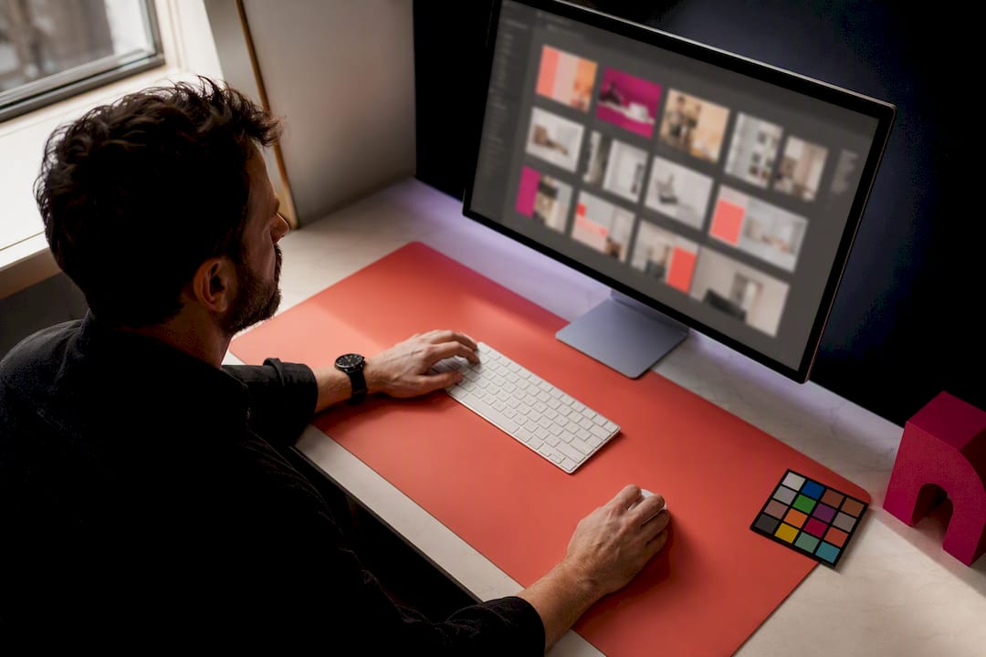
A brand photography guideline defines the visual rules so every image, across web, social and ads, reads as the same brand. Done properly, it names concrete tools like Adobe Lightroom presets and a digital asset management system, not vague adjectives. This piece gives you the pillars, the technical rules, and the templates to make that happen without a bloated PDF nobody reads.
TL;DR:
- A brand photography guideline should specify exact technical parameters like color temperature ranges, lighting setups, and crop rules, not vague adjectives.
- It must differentiate between hero and supporting looks, with clear guidance on when to use each based on campaign scale and purpose.
- A detailed shoot brief, including objectives, audience, shot priority, and logistics, is essential to avoid costly reshoots and ensure deliverables align with brand values.
- Consistent editing presets, file naming conventions, and metadata tagging are crucial to preserving brand identity across all images and channels.
- Incorporating accessibility considerations such as diversity in casting and high-contrast overlays ensures inclusivity and improves overall audience engagement.
Table of Contents
- Visual pillars and photographic values
- Photographic techniques for lighting, composition and posing
- Photographic categories and use cases
- How to build the photography style guide document
- Briefing and planning a shoot properly
- Post-production, file formats and naming conventions
- Image governance and licensing
- Copyable templates for briefs and approvals
- Accessibility considerations in brand photography
- First-hand lessons from a working commercial photographer
- Let a professional handle the brief, the shoot and the delivery
- Sources
- FAQ
Visual pillars and photographic values
Every strong photography style starts with values, not gear. Pick three to five brand adjectives, and map each one to a specific photographic choice. "Warm" might mean golden-hour light and 3200K to 4000K white balance. "Confident" might mean tighter crops and direct eye contact rather than candid glances away from camera.
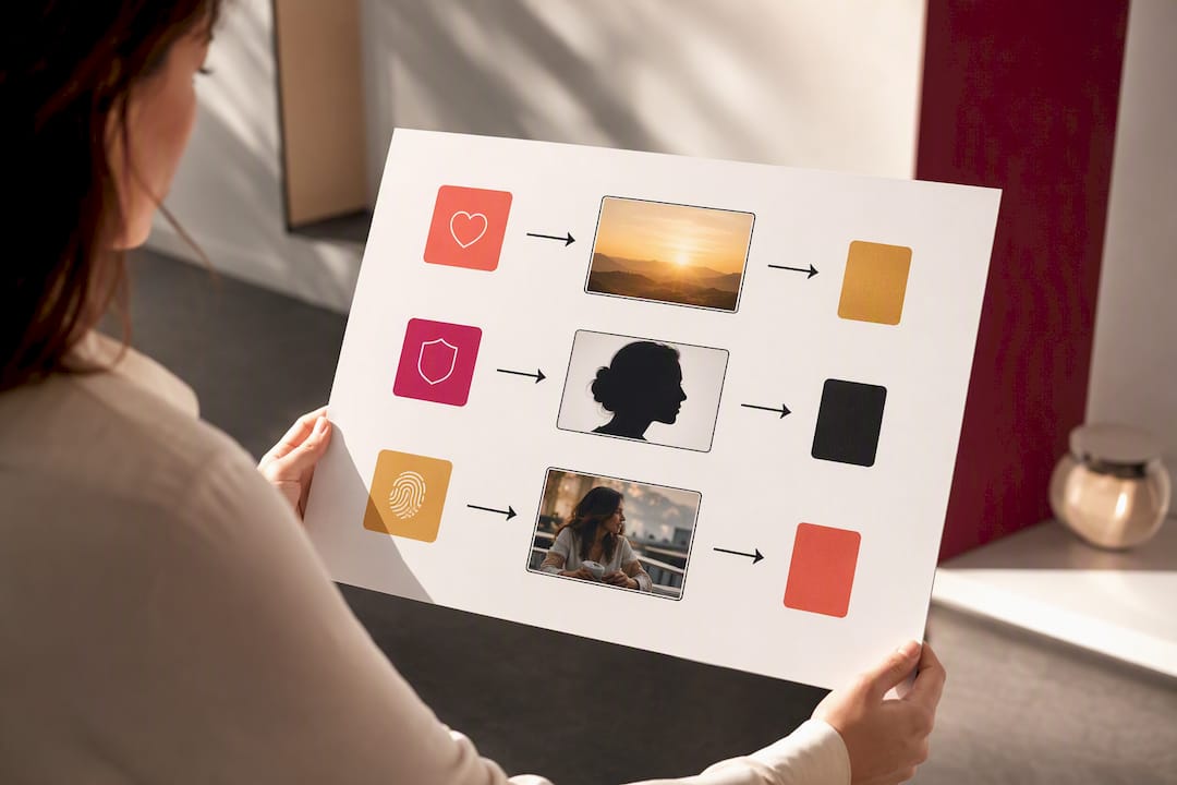
Institutional brand guidelines consistently start this way: values first, technique second, categories third. That order matters because a photographer briefed on "authentic, warm, unpolished" will make better on-the-spot decisions than one handed a shot list with no context.
You also need a hero look and a supporting look. The hero look is reserved for major campaigns, big-budget, fully art-directed, used sparingly. The supporting look covers fast-turn social content and needs to be quick to shoot and edit while still recognisably yours.
Translate values into rules like this:
- Authentic: candid moments over posed lineups, natural expressions, minimal retouching.
- Diverse: genuine representation across age, ethnicity and body type in every people-based shoot, not just the hero campaign.
- Warm: golden or amber colour grading, avoid cool blue-grey tones.
- Premium: shallow depth of field, negative space, controlled backgrounds.
Photographic techniques for lighting, composition and posing
Technique is where style guides usually fall apart, because "natural light preferred" means nothing without parameters. Give your team and any external photographer numbers to work from, not adjectives.
- Lighting: set a white balance range within a practical temperature range and specify when natural light is required versus when studio lighting is acceptable, for example product shots always studio, lifestyle always natural.
- Composition: define your standard crops appropriate for each channel to ensure proper framing so nobody discovers mid-shoot that a hero image can't be cropped for a story.
- Posing: distinguish candid direction ("walk and talk, we'll catch you laughing") from editorial direction (chin down, shoulders angled, direct gaze).
- Location: confirm permissions, check power access for lighting kit, and scout for background clutter before the crew arrives.
Pro Tip: Shoot your "safe" hero shot first, exactly to brief, before experimenting. If the light changes or a location falls through, you already have the deliverable that matters most.
Photographic categories and use cases
Different categories serve different jobs, and mixing them up wastes a shoot day. Product photography needs consistent white backgrounds and true colour rendering. Lifestyle needs real environments and natural interaction. Portraits need consistent lighting across a whole team so nobody looks out of place on the "About" page.
- Product: white or brand-colour backdrop, 1:1 crop for e-commerce and marketplace listings.
- Lifestyle: natural settings, 4:5 or 16:9 depending on channel.
- Portraits: consistent lighting rig and background across all subjects, 1:1 or 4:5.
- Detail/texture: macro or close crop, used for product pages and packaging call-outs.
- Event/editorial: documentary style, wide range of crops for recap content and PR.
Stock imagery can plug gaps for generic concepts, but public-sector guidance rightly treats it as a supplement to a curated library, not a substitute for commissioned photography that actually shows your product or people.
How to build the photography style guide document
A style guide only earns its place if people actually open it. Keep it modular: short sections, real examples, nothing decorative. Shopify's guidance on photography style guides recommends covering colour palette, focal length, lighting and editing presets, exactly the operational detail most guides skip in favour of mood boards.
Structure it around these sections:
- Visual pillars and brand adjectives (from Section 2)
- Composition and crop rules per channel
- Colour palette with hex codes and colour temperature ranges
- Casting and representation guidance
- Lighting setup notes
- Editing presets and retouch limits
- File delivery and naming conventions
Include operational assets, not just rules: downloadable Lightroom presets, annotated example images, and a side-by-side of acceptable versus unacceptable shots. Annotated references consistently outperform mood boards alone, because a caption explaining why an image works travels better than aesthetic inspiration with no reasoning attached.
Store the finished guide inside your digital asset management system, version it, and name a single approver, usually the brand manager, so photographers and freelancers always work from the current file rather than an email attachment from 18 months ago.
Briefing and planning a shoot properly
A shoot only produces what the brief asks for. A tight creative brief paired with a shot checklist is what separates a session that delivers everything you need from one that needs a costly reshoot.
Your brief needs:
- Objectives — what the images need to achieve and where they'll live.
- Audience and tone — who's viewing these, and what feeling they should get.
- Hero and supporting shot list — ranked by priority, so nothing critical gets missed if time runs short.
- Usage and deliverables — formats, crops, and licence terms needed.
- Logistics — model releases signed in advance, location permissions confirmed, props and wardrobe checked the day before.
On shoot day, apply a simple triage rule: capture every "safe" shot on the priority list first, then use remaining time for creative experimentation. Our own planning guide for lifestyle brand shoots walks through exactly this call-sheet structure.
Post-production, file formats and naming conventions
Editing consistency is where most brands quietly lose their identity. Presets and clearly defined retouch limits keep every image recognisable, whether it's edited by you, a freelancer, or an agency three months from now.
- Approve one Lightroom or Capture One preset per photographic category, applied before any manual adjustment.
- Deliver master files (uncropped, full resolution) alongside channel-ready exports: web, social, print.
- Use a consistent naming convention, for example
brandname_category_date_number.jpg, and tag metadata by campaign and usage rights inside your DAM. - Check that any text overlay on an image meets basic contrast standards so it stays legible for readers with low vision.
Pro Tip: Export web images with sRGB colour profiles, not Adobe RGB, or your carefully graded warm tones will look flat and grey the moment they hit a browser. Our colour profile guide covers the export settings that most commonly get missed.
Image governance and licensing
Nobody wants a legal letter three months after a campaign launches because a model release was never signed. Governance is unglamorous but non-negotiable.
- Commercial licence: covers use across your own channels and paid ads. Confirm duration and territory before the shoot, not after.
- Editorial licence: for events or PR use only, cannot generally be repurposed for advertising.
- Model release: sign it before the shoot begins, not after, to avoid usage delays later.
- Archive rules: set an expiry date for campaign-specific imagery and name one approver who signs off any image entering the permanent brand library.
Copyable templates for briefs and approvals
Speed matters when marketing teams are stretched thin, so keep these ready to reuse.
- Five-line brief: objective, audience, hero shot, deliverables, deadline.
- 10-point approval checklist: covers lighting match, crop compliance, colour grading, model release on file, and five more brand-specific checks.
- Half-day shot list: 8 to 10 priority shots, one location, one setup.
- Full-day shot list: 20 to 25 shots across two to three locations, built around the PLACE framework.
Store every template and preset inside the same DAM folder as your style guide. A template nobody can find gets rewritten from scratch every time, which is exactly the inconsistency you're trying to avoid.
Accessibility considerations in brand photography
Accessibility in photography isn't an afterthought bolted on at export. It starts at casting and runs through to file delivery.
Inclusive representation means your imagery reflects the real range of people who use your product or service, not a narrow, aspirational slice of it. That means briefing photographers explicitly on diversity of age, ethnicity, body type, and visible and invisible disability, rather than leaving it to chance on shoot day. A guideline that simply says "diverse" without casting direction usually produces the same three demographics repeated across every campaign.
Visual accessibility matters just as much for people viewing the finished image. Any photograph carrying a text overlay, quote cards, pull-out stats, promotional banners, needs sufficient contrast between text and background so it's legible for readers with low vision. Avoid placing critical text over busy or low-contrast areas of an image; build in a plain background zone at the brief stage if you know text will sit there later.
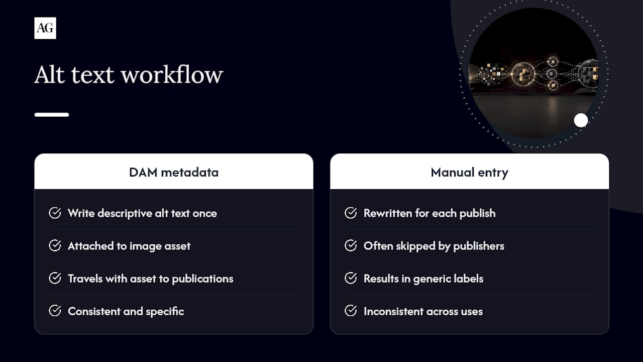
Alt text deserves the same rigour as your naming convention. Write descriptive, specific alt text for every published image rather than a generic "team photo" or "product shot", since that's the only version many screen-reader users experience. Build this into your DAM metadata fields so it's captured once and travels with the asset everywhere it's used, rather than being written fresh, or skipped, by whoever happens to publish it.
First-hand lessons from a working commercial photographer
A well-planned shoot with a clear brief and a named lead consistently produces more usable selects, because decisions get made on the day instead of debated afterwards. For small teams, the shortcut is ruthless prioritisation: shoot your three hero images perfectly, then batch quick supporting content around them rather than treating every frame as equally important.
— Alex
Let a professional handle the brief, the shoot and the delivery
There's a real cost to running all this in-house: hours spent building briefs, chasing model releases, and re-editing images that don't quite match your palette. Alex Gell removes that entire layer by managing the brief, the shoot day, and the delivery as one accountable process, so your brand guidelines actually get followed rather than reinterpreted by whoever's holding the camera.
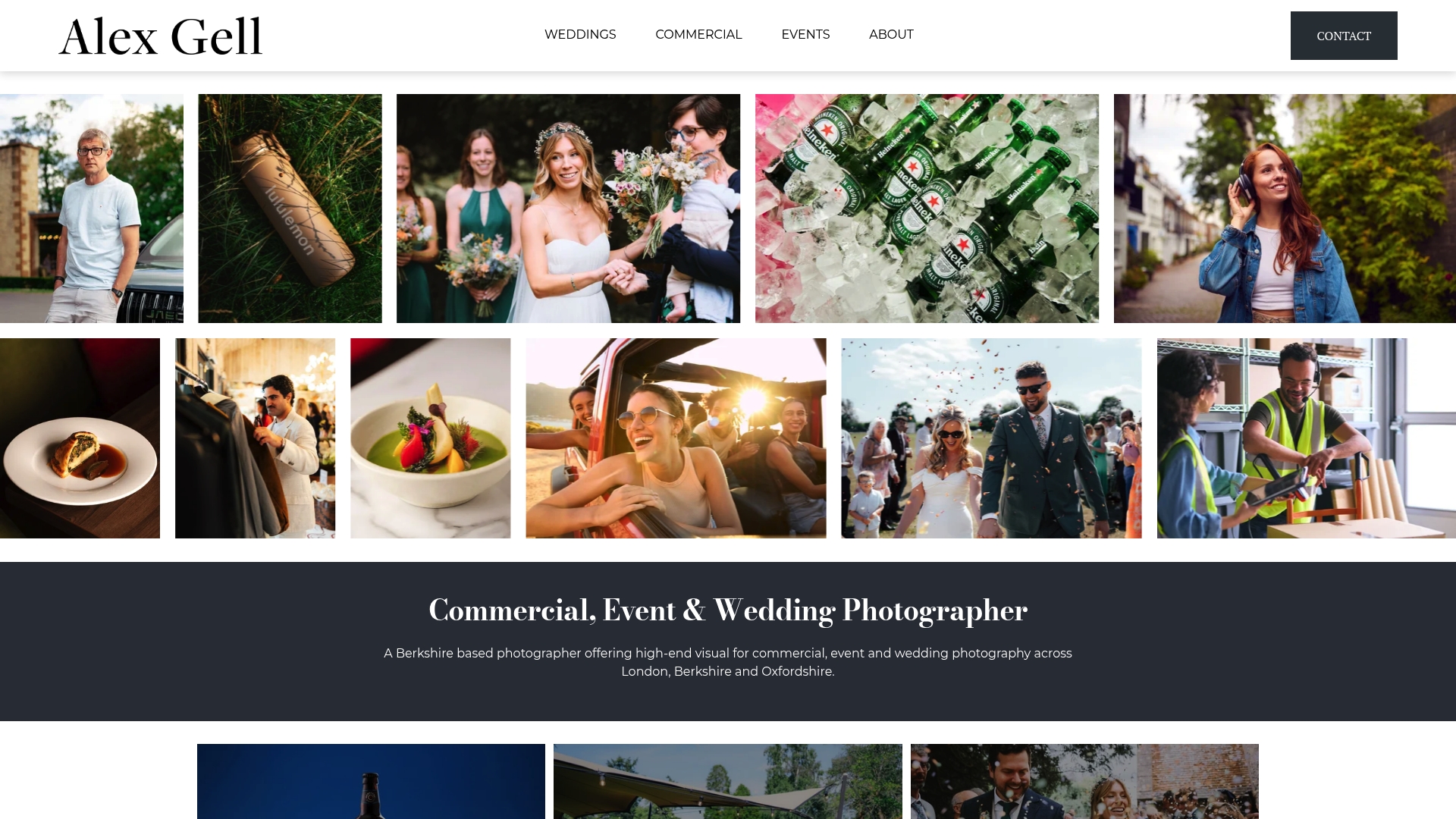
A typical commission includes a briefing call to confirm your visual pillars and shot list, a shoot day run with the PLACE-style checklist covered earlier, and delivery of graded master files plus channel-ready crops within an agreed turnaround. Whether you need commercial photography in London, Berkshire, or Oxfordshire, the process stays the same: your rules, applied consistently, without you having to manage every technical decision yourself. Get in touch to check availability for your next shoot date.
Sources
- 06 Photography - Brand Guidelines - Open University
- Photography – Brand guidelines - ONS Service Manual
- How to Build a Brand Photography Style Guide | Shopify
- Brand Photography for Business: Plan a Shoot | Sproutbox
FAQ
What Should Brand Photography Guidelines Include?
They should cover visual pillars, composition and lighting rules, colour palette, casting guidance, editing presets, and file delivery conventions, ideally stored in a shared DAM system rather than a static PDF.
How Long Should a Photography Style Guide Be?
Long enough to cover every operational section without padding, typically a working document rather than a lengthy brand book, with example images doing more work than long descriptions.
Do I Need a Model Release for Every Shoot?
Yes, whenever a recognisable person appears in commercial imagery, sign the release before the shoot to avoid usage delays later.
Should I Use Stock Photos or Commission Custom Photography?
Stock can fill generic gaps, but commissioned photography, like a session planned around your specific brief, is the only way to consistently show your actual product, people and spaces.
How Often Should Brand Photography Guidelines Be Updated?
Review them whenever your visual identity shifts or annually at minimum, since presets, casting standards and channel crop requirements change faster than most teams expect.
